This makes me feel Afraid Amused Delighted Humored Intrigued Ironic Uncomfortable at an Personal / Private scale
Toiletpaper Magazine – Website
Website
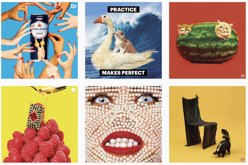
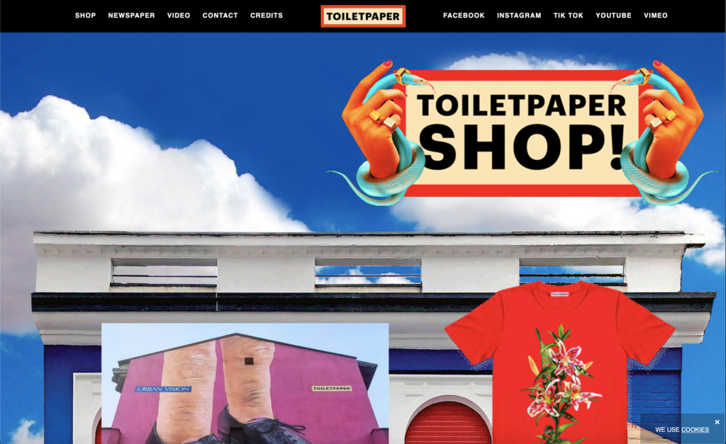
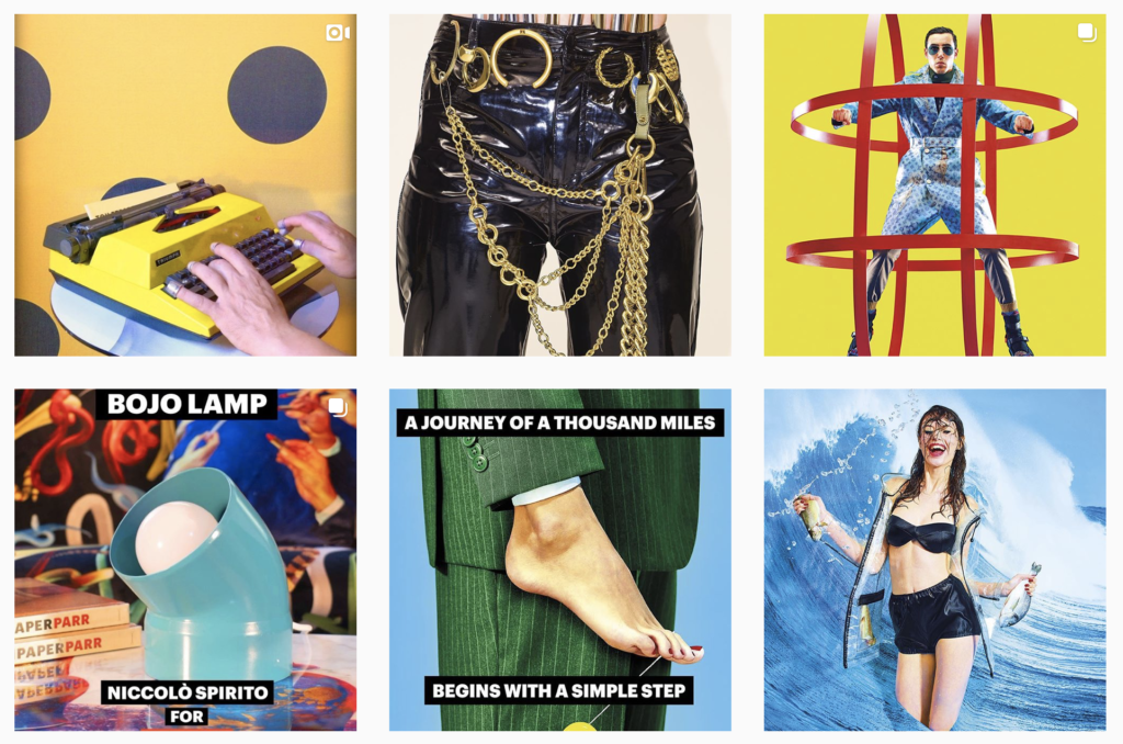
Though Toiletpaper Magazine started as an actual magazine, their most notable feature is their long, unending scroll of a website. It is a lengthy amalgamation of campy images and phrases that live to both excite and concern the audience. The compositions vary slightly from platform to platform, but both the website and the instagram are a source of lighthearted sit-com-like digital collages. Toiletpaper Magazine also works on advertisements for such companies as San Pellegrino. In a world where people are constantly taking in information and burning through media, making a website and a brand into an experience that extends beyond the first impact. Scrolling through the homepage feels much like falling into the rabbithole from Alice in Wonderland.
Contributor notes
What is surprising, refreshing, most interesting?
Toiletpaper Magazine goes for the absurd and the sometimes-alarming much like a visual representation of a slapstick comedian.
Key Insights? What can we learn from this?
Anything can be transformed into an experience, even as small as a promotional website.


